Webs of Minds and Ideas Bind Duke’s Campus
Visualizations of the Scholars@Duke database map our university’s scholarly connections
The era of the lonely genius is over. These days, research success usually requires teams of scholars, often crossing over departments, disciplines or continents, who combine their unique tools and tactics to take on previously insurmountable problems.
Duke’s Office of the Vice Provost for Research recently invited data scientists from around the university to mine the vast Scholars@Duke database to create visualizations that show these teams and “capture the richness and dynamism” of scholarly networks at Duke.
The Visualizing Scholars@Duke challenge revealed patterns that are both obvious and unexpected. For example, even in the age of virtual collaboration tools like e-mail and Slack, researchers whose offices are closer together still appear to be more likely to work together.
“The value of these visualizations is that they are teasing out the interactive structure of the University,” said Mark DeLong, director of Duke Research Computing. “You see key players, you see malleable and diversifying subjects and you begin to see ways to foster collaboration.”
Scholars@Duke is a one-stop shop for information on Duke research, compiling data on published articles and books, awards and honors, grants, education and teaching expertise for each of the scholars working at Duke. But the real magic is in how these minds and personalities come together over shared interests and put their ideas together in new ways.
“I am always looking for ways to provide exposure to the interesting data science research being done at Duke,” said Vice Provost for Research Larry Carin. “I felt that doing a Visualizing Scholars@Duke challenge would get the attention of many of our people interested in such work, and placed a focus on the utility of Scholars@Duke for understanding Duke research.”
Six teams tackled the complex data set from different angles, resulting in a series of colorful, interactive visualizations that show the complexity of these research networks.
David Bradway, a research scientist in biomedical engineering, created a “suggested collaborators” tool. Like the “suggested friends” section on Facebook, this tool uses previous co-authors and their contacts to point out promising future collaborators.

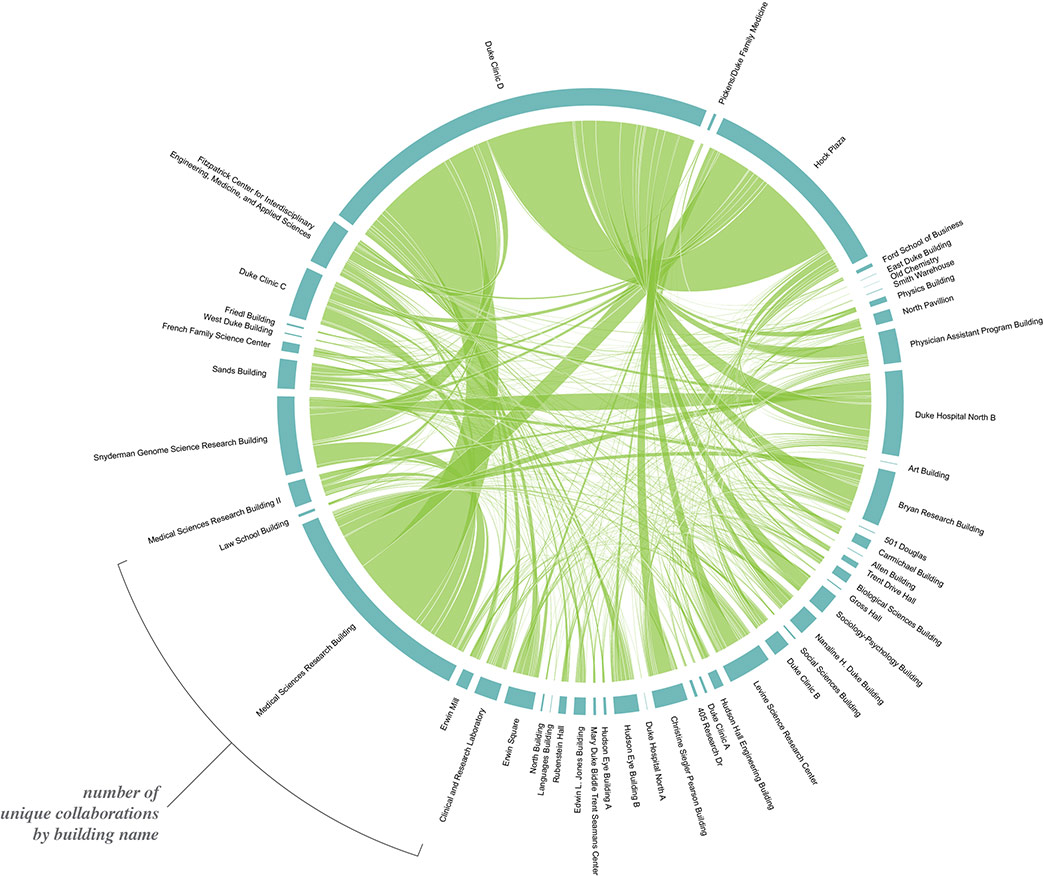
Winner Jeff MacInnes, a postdoctoral fellow in neurobiology, took a different approach to the challenge, using additional data provided by the Duke Plant Accounting office to links sets of collaborators together across a map of Duke’s campus.
“As soon as I dove into the data, I started wondering how proximity might influence the likelihood of collaboration among scholars, and from there it was a short leap to the idea of visualizing these collaborations geographically,” MacInnes said.
Overall, the data supported the theory that greater proximity between researchers leads to more collaboration. MacInnes found that fifty percent of collaborations occurred between scholars in the same department, or between researchers in departments that occupy the same building.
However, the Physician’s Assistant program, located at 800 S. Duke St. in the bottom right corner of the map, proved a notable exception. “The folks working there could probably make a compelling case for being relocated closer to campus,” MacInnes said.
Sociology Professor James Moody and the team at the Duke Network Analysis Center decided to look at where scholars fit into Duke’s “intellectual space” rather than its physical space.

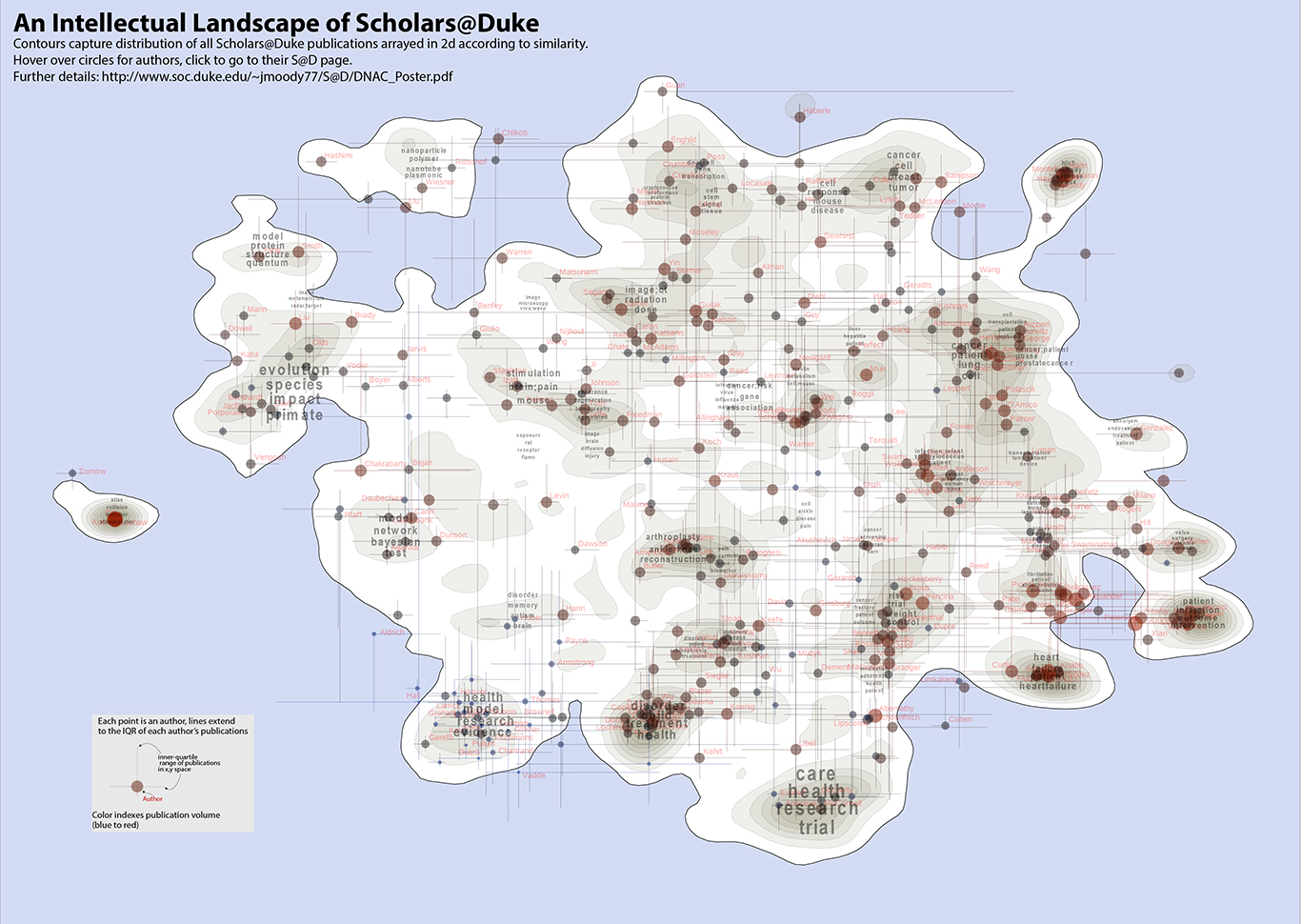
Professor James Moody and his team used language processing software to analyze the titles and abstracts of publications listed in the Scholars@Duke database and used the results to map Duke’s intellectual space.
The team created the intellectual space by first gathering the titles and abstracts of publications listed in the Scholars@Duke database, and then used language analysis software to map the papers according to similar use of terms.
“Essentially if you and I are writing about the same things, we should be in a similar region in space,” said Moody, who served as a judge and so did not enter his team’s analysis in the challenge.
In Moody’s analysis, Duke’s intellectual space resembles a topographic map of a mountainous landscape, with peaks showing clusters of topics where many papers have been published, and valleys where few have been published. Small “islands” indicate fields that are highly specialized, such as particle physics, which sits on its own on the left side of the map
The right side of the landscape, with prominent nodes representing cardiology, cancer and surgery, highlights the diversity in health and medicine research at Duke. And the close integration between health on the right and engineering, science, and computation on the left illustrates the high degree of connectivity between the university and the medical school. Topics in the arts and humanities are underrepresented, Moody said, because the Scholars@Duke data is much less complete in these disciplines.
After creating the initial landscape, Moody’s team mapped other elements of the university on top of it, including departments, gender distribution of authorship and known collaborations.
In this interactive version of the visualization, each scholar has been mapped at the center of their authored papers, and the lines indicate the span of their research interests – researchers with shorter lines are more specialized in their publication topics, and those with longer lines are more broad. Clicking on a researcher brings you to his or her Scholars@Duke site.
This close-up look at Duke’s scholarly networks is part of a broader Bass Connections project to examine collaborations within different fields of study within the larger research community.
“We see this as a first-pass on the project,” Moody said. “It’s a way to see what’s there and guide future work on mapping the topical and collaboration space at Duke with an eye toward identifying untapped potential collaboration and research investment niches in the intellectual landscape.”